Everything about HD, MD, and their mods.
Moderator: Halo Moderators
-
Sparky
- Delta Force
- Posts: 4194
- Joined: Wed Mar 31, 2004 8:59 pm
- Location: New Jersey, USA
-
Contact:
Post
by Sparky » Tue Nov 27, 2007 9:52 am
Why not just make it MacSpark, and use a picture of GuiltySpark for the icon?
Either you are groping for answers, or you are asking God and listening to Jesus.
-
TaxiService
- Night Stalker
- Posts: 6887
- Joined: Thu May 24, 2007 5:52 am
- Location: 41.896198, 12.4165945
-
Contact:
Post
by TaxiService » Tue Nov 27, 2007 10:48 am
@ sparky: because that sucks!
@ drac:
well... the S and E letters was the things i would avoid :-\ because those are same with SparkEdit.. you know...
...anyway, doesnt look bad. maybe give it a different look, like, not only white and black, but maybe aqua-like style >_> <_< dunno

PS: i like first one more.
EDIT: im trying some variants on it.
- TaxiService! Shitposting since 2007!

-
TaxiService
- Night Stalker
- Posts: 6887
- Joined: Thu May 24, 2007 5:52 am
- Location: 41.896198, 12.4165945
-
Contact:
Post
by TaxiService » Tue Nov 27, 2007 12:16 pm
how is something like this?

:-\ i have no time to finish it now...
i'll have time tomorrow, seeyas
PS: sorry for double post?
- TaxiService! Shitposting since 2007!
-
Moxus
- Delta Force
- Posts: 4704
- Joined: Sun Jun 24, 2007 9:01 am
- Location: {_-({[]})-_}
-
Contact:
Post
by Moxus » Tue Nov 27, 2007 12:20 pm
I think that your version is better, Taxi. However, nice design Draconic.
-=Moxus=-

Kayar wrote:The Collective: Spamming its way to a better tomorrow.
Many thanks to the people who have made my years on MGM and on Halo Demo so memorable.
-
zapconquest
- Ranger
- Posts: 1336
- Joined: Sat Dec 09, 2006 11:31 am
- Location: on a secret mission in uncharted space
-
Contact:
Post
by zapconquest » Tue Nov 27, 2007 12:25 pm
I like drac's more but I think it should be a little smoother. Maybe put a small blur on the letters and sword.
-
lord lagger
- Veteran
- Posts: 339
- Joined: Tue Aug 21, 2007 2:25 pm
- Location: in the middle of god dammed f***ing nowere!
-
Contact:
Post
by lord lagger » Tue Nov 27, 2007 12:58 pm
i got an idea!!!(dosent happen much dose it?)
instead of puting S and E..
put SWD on top of EDT
like this:
SWD
EDT
ill get a pic up of what im thinking of soon..
-
TaxiService
- Night Stalker
- Posts: 6887
- Joined: Thu May 24, 2007 5:52 am
- Location: 41.896198, 12.4165945
-
Contact:
Post
by TaxiService » Tue Nov 27, 2007 2:12 pm
well, lord lagger, you got a great idea IMHO.
- TaxiService! Shitposting since 2007!
-
sword
- Ranger
- Posts: 1077
- Joined: Tue Feb 07, 2006 6:53 pm
Post
by sword » Tue Nov 27, 2007 8:09 pm
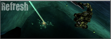
I'm thinking of something more along the lines of this...
The sword.

-
P!ckoff
- Ranger
- Posts: 1768
- Joined: Fri Jul 21, 2006 8:45 am
- Location: They haven't told me yet.
-
Contact:
Post
by P!ckoff » Tue Nov 27, 2007 8:25 pm
Ouch. Taxi, if you are making one, make sure it is Leopard ready. 512x512, I think.
 Xpro + 3D texture
-
TaxiService
- Night Stalker
- Posts: 6887
- Joined: Thu May 24, 2007 5:52 am
- Location: 41.896198, 12.4165945
-
Contact:
Post
by TaxiService » Tue Nov 27, 2007 9:37 pm
P!ckoff wrote:Ouch. Taxi, if you are making one, make sure it is Leopard ready. 512x512, I think.
LEOPARD HAS 512x512 ICONS!!?!?!!!!

WHAAAAAAAAAAAAAAAAARGHR!!
this-this-this this this---mgrggrgr araght GRGRGRGR
- TaxiService! Shitposting since 2007!
-
>Shadow<
- Halo Moderator

- Posts: 2734
- Joined: Sun Apr 02, 2006 9:15 pm
Post
by >Shadow< » Tue Nov 27, 2007 10:19 pm
Based on this picture, I really, REALLY doubt that Leopard uses 512 x 512 size icons. In fact, I don't think they have been changed in any way, shape, or form.

-
Moxus
- Delta Force
- Posts: 4704
- Joined: Sun Jun 24, 2007 9:01 am
- Location: {_-({[]})-_}
-
Contact:
Post
by Moxus » Wed Nov 28, 2007 3:32 am
The icons themselves have changed, I can tell you that.
-=Moxus=-
Kayar wrote:The Collective: Spamming its way to a better tomorrow.
Many thanks to the people who have made my years on MGM and on Halo Demo so memorable.
-
Andor
- Operative
- Posts: 243
- Joined: Mon Dec 11, 2006 3:17 am
Post
by Andor » Wed Nov 28, 2007 5:02 am
Yeh. But for the better in my opinion.
-A
-
Fonzeh
- Ranger
- Posts: 1894
- Joined: Tue Oct 16, 2007 3:57 am
- Location: "I didn't just take your mom out to dinner. I ate your mom for dinner."
-
Contact:
Post
by Fonzeh » Wed Nov 28, 2007 6:34 am
Well How about a Sword Be Placed Straight through EDIT. Like instead of writing out the words or SE Have like edit in the middle with a Sword through it lol. I think that would look pretty sweet.
G[v]N wrote:HUGE NOTIFICATION
THIS GRAVY HAS BRAINS
Mota-Lev was here 30/4/2010@2:18pm

-
zapconquest
- Ranger
- Posts: 1336
- Joined: Sat Dec 09, 2006 11:31 am
- Location: on a secret mission in uncharted space
-
Contact:
Post
by zapconquest » Wed Nov 28, 2007 12:34 pm
Icons that were made for previous OSs look really crappy in cover flow. That's where the 512x512 icons come in.
Who is online
Users browsing this forum: No registered users and 25 guests