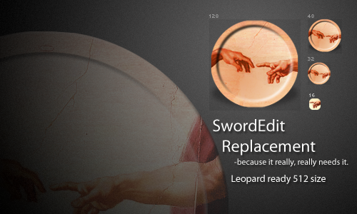
SwordEdit- because it really, really needs a replacement
Posted: Thu Jun 26, 2008 5:42 pm
A replacement icon because it desperately needs it.
This accomplishes a few things. It brightens the icon so it goes better with the system, adds a drop shadow (*shock!*), corrects the feeble attempt to make an emboss that left it looking like a leaking cup or earl gray tea had been set on it, makes it seem less blurry, and rounds out the edges.
Also, this has a 512 version. For awesome Leopard users like mà.
Enjoi