sorry for the delay
Forum Logo Challenge
-
§hÎn£¥ H€llm£†
- SEAL
- Posts: 464
- Joined: Fri Mar 14, 2008 4:07 pm
- Location: In Fonzie's Pelican on its way to New Mombassa. I have NO clue how i'm supposed to finish this fight
Re: Forum Logo Challenge
Here it is!
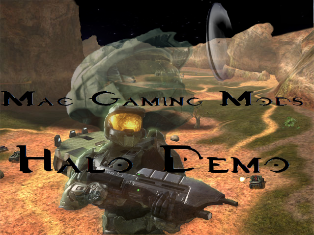

sorry for the delay
sorry for the delay

Lies for the weak...Beacons for the deluded
I shall have my revenge on a prophet, not a plague!
Re: Forum Logo Challenge
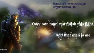
sparky is the man wrote:Monk, I think you should center the text in the middle of the green circle, and then trim it down in size, making the background transparent.
I am also left wondering what the point of it is.
Erm..... the point is....... it looks cool? What's the point of the space fractal?
The text isn't centered so it looks like it's drifting. I can't edit it any more cause I converted it to PNG.

Re: Forum Logo Challenge
Yeah, no kidding.
It seems as if mine was the only one that matches the color scheme... >.<
It seems as if mine was the only one that matches the color scheme... >.<
-
§hÎn£¥ H€llm£†
- SEAL
- Posts: 464
- Joined: Fri Mar 14, 2008 4:07 pm
- Location: In Fonzie's Pelican on its way to New Mombassa. I have NO clue how i'm supposed to finish this fight
Re: Forum Logo Challenge
Oh whoops, i somehow thought that this was for each game...
what a waste of time...
what a waste of time...
Lies for the weak...Beacons for the deluded
I shall have my revenge on a prophet, not a plague!
Re: Forum Logo Challenge
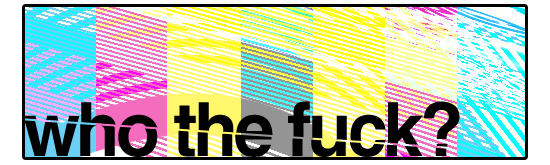
I hate to bump this topic, but I just made a few logos in my free time.

Future style.
Uhh, I'm not shure why I made this, but it's pretty good.

Ye olde modding community.

Basic stamp.
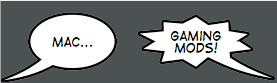
Future style.
Uhh, I'm not shure why I made this, but it's pretty good.
Ye olde modding community.
Basic stamp.
Re: Forum Logo Challenge
Seafire could you please inform me of what font the last logo was.
The armaments which thunderstrike the walls
And monarchs tremble in their capitals.
The oak leviathans, whose huge ribs make
Of lord of thee, and arbiter of war;
Alike the Armada's pride, or spoils of Trafalgar.
Re: Forum Logo Challenge
"Portagol" something.

Re: Forum Logo Challenge
All of them added.
Kansas....Like Paris Hilton: White, Flat, and Easy to Enter. -- Conan O'Brien
Masturbation is like procrastination, they're both great until you realize your screwing yourself.
MGM Discord | MGM Chat

Masturbation is like procrastination, they're both great until you realize your screwing yourself.
MGM Discord | MGM Chat


Who is online
Users browsing this forum: Google [Bot] and 20 guests